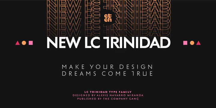
It’s a workhorse typeface, a geometric sans-serif with a semi-closed aperture and a large x-height. This font is the result of a series of wonderings regarding geometric Sans Serif typography design, in particular; Futura of Paul Renner.
The result is a sans serif, geometric, modern typeface with classical Roman proportion in the uppercase letters; two stylistic sets for lowercase letters (setKoch and setRenner), rational, open and sharp ends. It is ideal to form titles, medium length texts, branding, exhibitions and animations.


