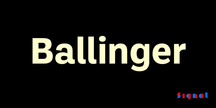
This font is a generic and neutral typeface but with enough personality to be different, but not as much to be unfamiliar. The family takes its name from Raymond A. Ballinger, the great mid-century American designer, author of ‘Lettering Art in Modern Use,’ and champion of elegance and readability. Ballinger has large counters and a generous x-height. Letters like a, e, and s open out gradually as they move from Thin to Black to maintain ample apertures, even in the darkest weights. Semi-oldstyle figures are available, as well as case-sensitive punctuation and delimiters. Italics incor


