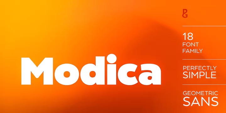
It’s a sans serif family created by Paulo Goode with a contemporary monolinear character, though designed with the iconic proportions of Roman capitals in mind. This typeface began life as “Meccanica” – a quirky, heavy, engineering typeface, that later evolved into the more conservative “Technica” type family. And now, the typeface has been distilled down to its simplest and most perfect form to become “Modica”.


