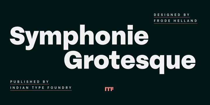
This is a sans serif type family of ten weights. It’s designed and shared by Indian Type Foundry. There are five different weights available, ranging from Regular through Heavy. Each weight has an upright and an italic font on offer. Symphonie Grotesque’s italics are what really set it apart from other neo-Grotesque families. Symphonie Grotesque is an excellent selection for use in branding or in other kinds of corporate identity design. It will surely also come into good use in design for galleries and publications about contemporary art. Symphonie Grotesque is the work of Frode Helland, a type designer from Norway.

